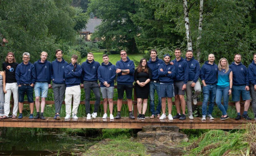
How we created a new communication and visual identity for visionaries of Czech philanthropy


It started subtly. In the fall of 2022, Dáša, the director of the Via Clarita foundation, reached out to our colleague Tomáš, saying she needed advice on a new website they were preparing. At that point, they had already drafted a wireframe and needed feedback before passing it on to the designer. However, after the first meeting, it became clear that they needed much more than advice on where to place a button. It was obvious to everyone that the website needed to be rethought in terms of the organization's goals and the needs of its target groups.
This marked the beginning of our journey together, during which we also helped Via Clarita clarify its organizational priorities, significantly advance its visual identity, and finally design and develop a website that serves as the cornerstone of their newly clarified path and helps them achieve their organizational goals.
Via Clarita develops the Czech philanthropic environment. It supports both emerging and experienced donors, including families, foundations, and companies, offering expert advice and creating opportunities for them to learn new approaches.
Marketing and content strategy
We always guide our clients to realize that a website must consistently align with organizational goals and marketing intentions. That’s why, during our workshops, we engage in dialogue on these topics, aiming to understand these two areas and clarify certain aspects, sometimes even redefining them. The process was no different for Via Clarita.
During a series of three workshops, we gradually concluded that Via Clarita primarily needed to increase demand for its consulting services and be persuasive enough for donors contributing to its educational activities. We mapped the needs and behaviors of target groups and redefined the brand, considering both the target audience profile and the team's visions. All of this was translated into marketing communication goals and the design of a new website concept.
Visual identity
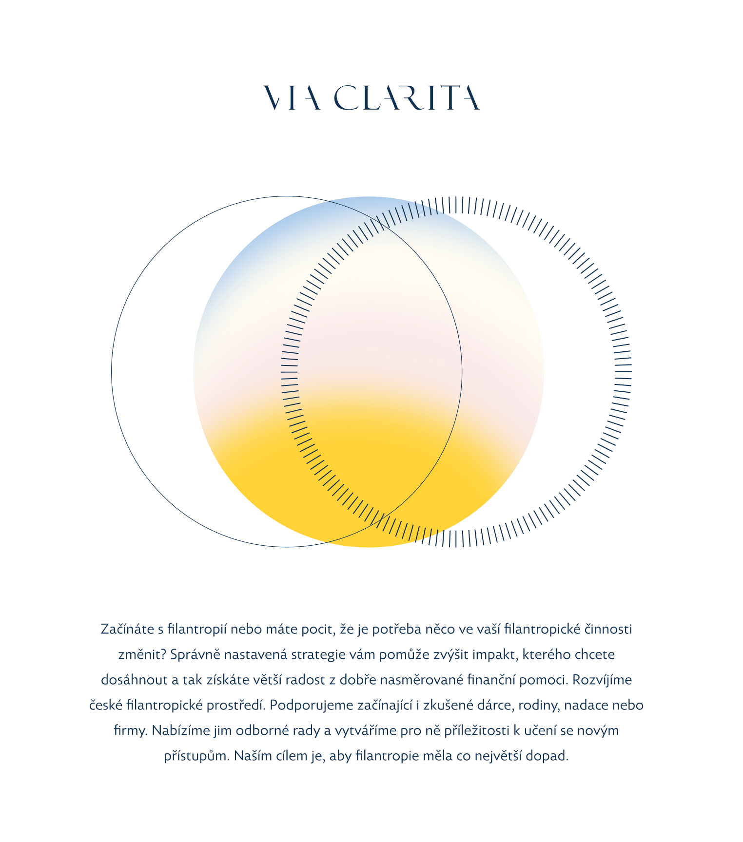
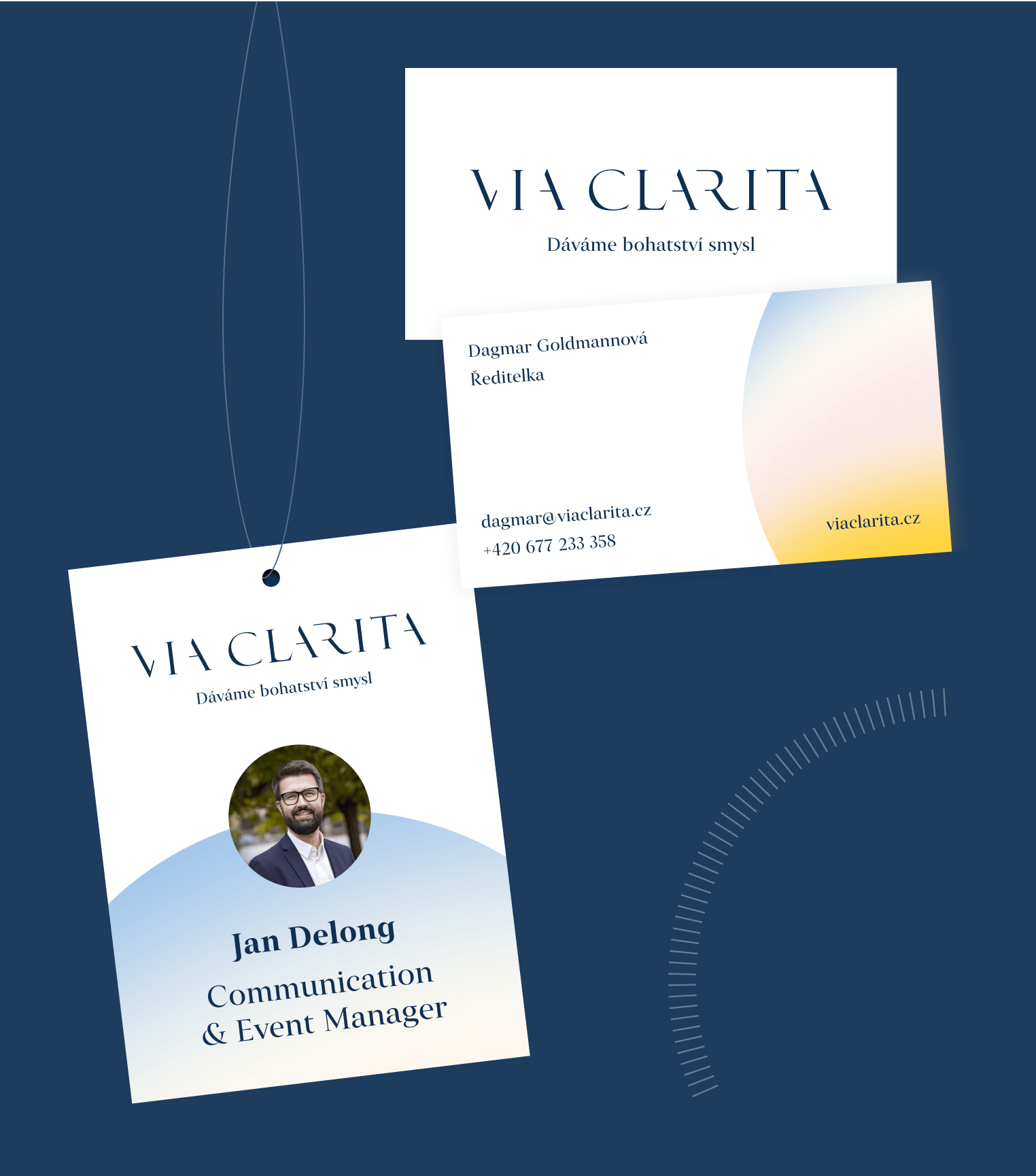
Thanks to our joint work during the workshops, we understood that Via Clarita needed to make significant changes in its visual communication. We needed to inject more life and lightness into their presentation, creating a sense of joy in being part of the philanthropic community that Via Clarita is building. Therefore, we decided to highlight event photography. We also lightened the font, created a pleasant color scheme inspired by sky tones, and applied it in a system of abstract illustrations and icons.
The web and its role
The main challenge in working on the website was balancing two aspects of Via Clarita's activities: 1) presenting itself as a non-profit organization with excellent results, and 2) positioning itself as a team of experienced professionals offering specific services. Behind these two communication lines were financial goals. Via Clarita needs to present its educational work to potential donors while also communicating that it provides professional consulting services for which it charges. Only in this way can the organization remain sustainable in the long term.

